Clean Hugs
Branding & Product
Transforming soap from a commodity to a lifestyle brand

THE CHALLENGE:
In France, where soap is traditionally seen as just a commodity, Clean Hugs sought to establish itself as a premium, lifestyle-oriented soap brand.
THE SOLUTION:
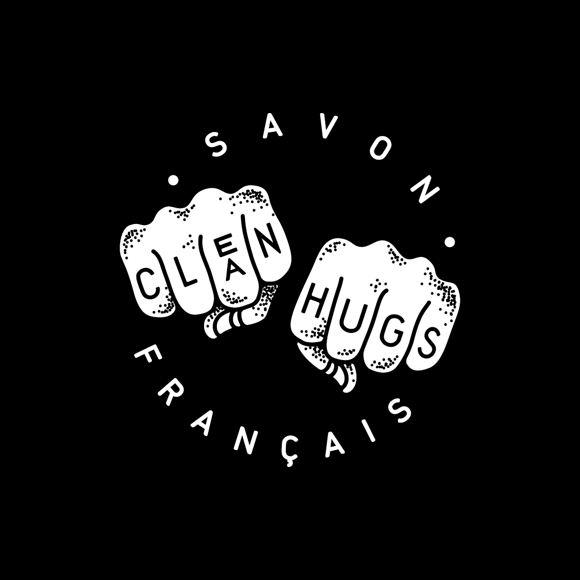
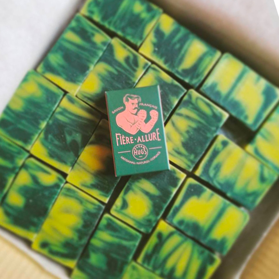
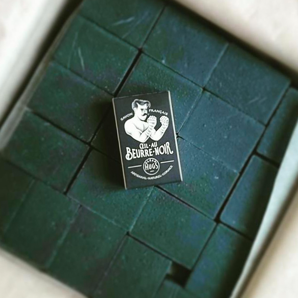
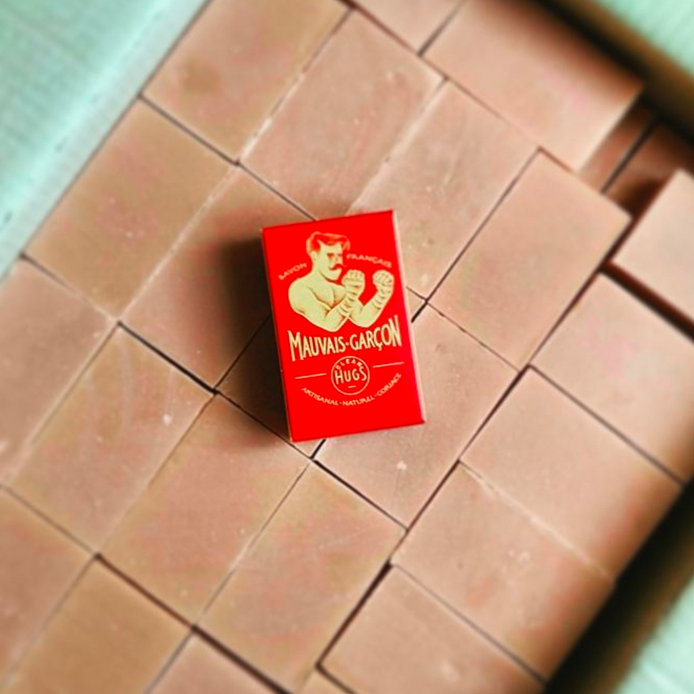
We developed a brand identity that was grounded in the athletic community, but designed to appeal to broad audiences. Utilizing tattoo-inspired artwork and the playful tone of an after-hours contact sport athlete, the brand was endowed with an edgy, yet approachable personality. Product names such as “Mauvais Garcon” (‘bad boy’) and the brand name “Clean Hugs” (calling fight matches as ‘hugs’) were crafted to evoke a sense of cheeky rebellion. The selective inclusion of English in the branding tapped into the youthful, fashion-forward segment of the French market, marking Clean Hugs as a trendy and in-the-know brand.
MY PART:
I was the Creative Director behind the brand system for Clean Hugs — concepting the look/tone/feel for the brand & the iconography of the fighter and hands, sourcing & overseeing illustrator Michele Marconi, designing packaging, directing product photography, and building out the design system for various outputs.
THE OUTCOME:
This strategic rebranding led a valuation of over €1M within the first year, and by the second year, the brand had achieved national chain distribution in France and international distribution to select retailers, transforming its market status from a common commodity to a sought-after lifestyle brand.


